Digital brand direction
Visual direction, tone, layout rhythm, and premium digital identity systems for modern websites and products.
BRAND & INTERFACE SYSTEMS
We create brand and interface systems for websites, apps, internal business software, and digital products — aligning typography, layout, components, visual direction, and interaction details into one consistent premium experience.


Digital brand systems for teams that need every website, product screen, and interface detail to feel consistent, premium, and ready to scale.
Visual direction, tone, layout rhythm, and premium digital identity systems for modern websites and products.
Reusable UI foundations for cards, buttons, forms, navigation, sections, dashboards, and product screens.
Type scale, spacing rhythm, section hierarchy, grid behavior, and responsive rules that keep screens consistent.
Micro-interactions, glass panels, motion rules, hover states, CTA styling, and visual details that make products feel refined.
Define the visual tone, audience expectation, premium level, and digital personality of the brand.
Create the design rules for sections, cards, CTAs, layout rhythm, hierarchy, and product surfaces.
Set type scale, spacing system, responsive behavior, content rhythm, and readability rules.
Build reusable UI patterns for buttons, forms, panels, badges, navigation, and product cards.
Add controlled hover states, transitions, motion rules, focus states, and premium micro-interactions.
Prepare the interface system so future pages, products, and sections can stay visually consistent.
Brand token board
Visual system
Typography scale
Type hierarchy
UI component kit
Reusable components
Landing page system
Section rhythm
Dashboard UI language
Product surfaces
Interaction polish board
Motion / hover rules
The same interface system work applies to dense admin UIs: alert hierarchy, metric grids, navigation rhythm, and scan-friendly typography — so marketing pages and control rooms feel like one studio.
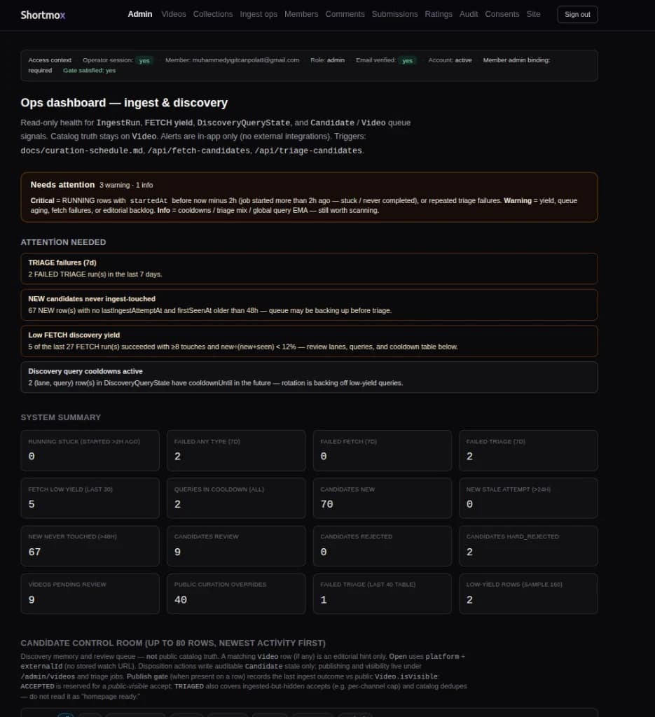
Production admin surface: triage signals, system summary, and candidate queues — patterns we reuse for client operations tools.
Full-stack visibility layout — services, infra posture, API checks, and scheduled jobs in one calm grid.
You want your website, pages, and visual system to feel more intentional, refined, and trustworthy.
Your app, dashboard, website, or admin panel needs consistent UI patterns, hierarchy, spacing, and reusable components.
You need a visual system that makes future pages, service sections, and product screens easier to build consistently.